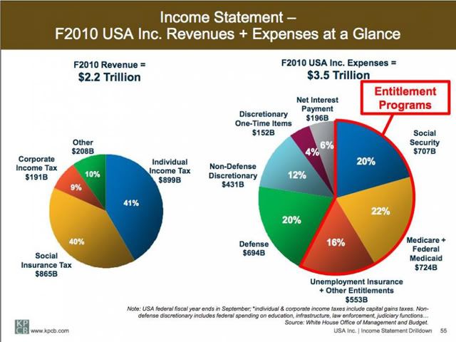
Blodget asks us to note a few things:
First, "Revenue" is tiny relative to "Expenses."
Second, most of the expense is entitlement programs, not defense, education, or any of the other line items that most budget crusaders normally howl about.
Third, as horrifying as these charts are, they don't even show the trends of these two pies: The "expense" pie is growing like gangbusters, driven by the explosive growth of the entitlement programs that no one in government even has the balls to talk about. "Revenue" is barely growing at all.
The phrase "Welcome to the Welfare State" is now dwarfed by the proof that we're already in the throes of it. How long is it going to take for us as a Nation to realize that we need genuine leadership more than ever?
If ever we needed a 'flip-flop', it's with this chart: lower taxes to increase employment, then CUT, CUT, CUT spending! We can start to curb the spending by looking at the latest GAO report and ridding the system of redundant programs that cost taxpayers billions of dollars each year! We can lower taxes and increase employment...well, when we get rid of the leftists in Washington, particularly the alpha head of the bloated hydra.
